
Pearl Health, a fertility clinic with answers.
Most case studies are self-congratulatory narcissistic jargles of design lingo that your eyes glaze over immediately.
Since you’re on this page, we’ll skip that and instead attempt to provide you with some insight into what branding is and how we specifically approach it.
So what the hell is branding?
The arts and crafts approach:
To some founders, branding seems to work like this: You provide information to a design firm, and then they go “get creative,” and out pop some colors and fonts. Congratulations, you just paid $10,000+ for something you could have created with a Canva template, right? This is the right-brained creative.
The gold-plated McKinsey approach:
To others, branding is highly specialized. You need to work with a firm that has a proven track record of collaborating with brands just like yours and extensive industry expertise. Branding is strategy-heavy. Data-driven. Spreadsheet-laden. Somewhere in the cross-tabs, a perfect brand position is waiting to be revealed. The outcome is the same fonts, colors, and logo that you could have paid $10,000 for, but you paid the equivalent of a mortgage instead.
Both of these views are wrong.
Both of these are wrong for two reasons:
Because they assume branding is something created outside the business.
Additionally, they think it’s either purely creative or purely strategic rather than the interplay of both.
We believe that branding is actually a process of removal, of stripping away what’s already there, which necessitates a marriage of both creative and analytical skills.
Here’s why this is a better model:
Most businesses have thought deeply about their category, product, and target audience. More information is usually not what’s needed. The real challenge is prioritizing which information is relevant—and how to use it.
Where good businesses often struggle is in knowing what to say, when to say it, and how to say it clearly. Because they’ve lived in their brand for so long, it’s difficult for them to step outside their own perspective and see things from the standpoint of their much less informed audience. This results in a complex web of positioning statements, features, benefits, and niche possibilities. Cutting through that tangle ruthlessly is not typically in their wheelhouse or their heart.
But it has to be done. A brand must be able to speak with a single, clear voice. Think of the greats: “Just do it.” “It’s what’s happening.” “Think different.”
What a great agency does is really quite simple. Through research, yes. Through creativity, absolutely. But most importantly, it supports business leaders in the hard work of saying no to distractions and off-brand opportunities, so they can say yes to a single, compelling message, core concept, or brand position that becomes the foundation for all their marketing.
Now, let’s look at how that process played out with Pearl Health & Reproductive.
Context and vision
Ashley and Ryan Womak founded Pearl Health and Reproductive in 2020 and saw immediate growth. The fertility space was expanding, driven by rising infertility rates and women delaying childbirth into their 30s. Pearl’s unique blend of timeless wisdom and modern expertise fueled their early success. Rooted in their Catholic faith, the Womaks believed the industry needed an alternative to IVF, which is often costly, ineffective, and focused on symptoms rather than causes. Pearl offers a holistic model that treats the whole family with targeted, effective interventions.
Despite early traction, their branding and marketing were weak. As competitors from hospitals to boutique clinics crowded the Dallas market, standing out became increasingly complex. To realize their vision of growing Pearl into a multi-location, multi-service healthcare brand, they needed a clear and distinct message.
Brand Strategy is a 3-body problem
The 3-body problem in physics describes the movement of three celestial bodies under their mutual gravitational influence. Unlike the two-body problem, which has a simple, predictable solution, the three-body problem is known for its chaotic and unpredictable nature. It's a classic example of deterministic chaos, where tiny changes in initial conditions can lead to vastly different outcomes.
Strategy is similar. You’re balancing the gravitational pull of three interconnected bodies. Insights in one area can lead to breakthroughs in another.
When we do strategy, we’re looking at three things:
The context.
The changes in the world, the category, or environment that matter. For Pearl Health, this looked like discussing the rise in infertility and its relationship to movements like MAHA or the growth of organic brands.The competitive set
What are the competitors getting wrong?
For Pearl, this meant analyzing the brands, product offerings, pricing, and client journey experiences of both the IVF and Natural Procreative Technology (NaPro) health spaces.The Audience
What behavioral insights can we uncover that will lead to a strategic breakthrough? What audiences aren’t being reached and why?
For Pearl, this looked like uncovering key insights that will be discussed below.
We asked a series of questions about the industry landscape, the competitive set, and Pearl’s potential audiences. We reviewed all publicly available data and resources from the client to gain a comprehensive understanding of these three elements.

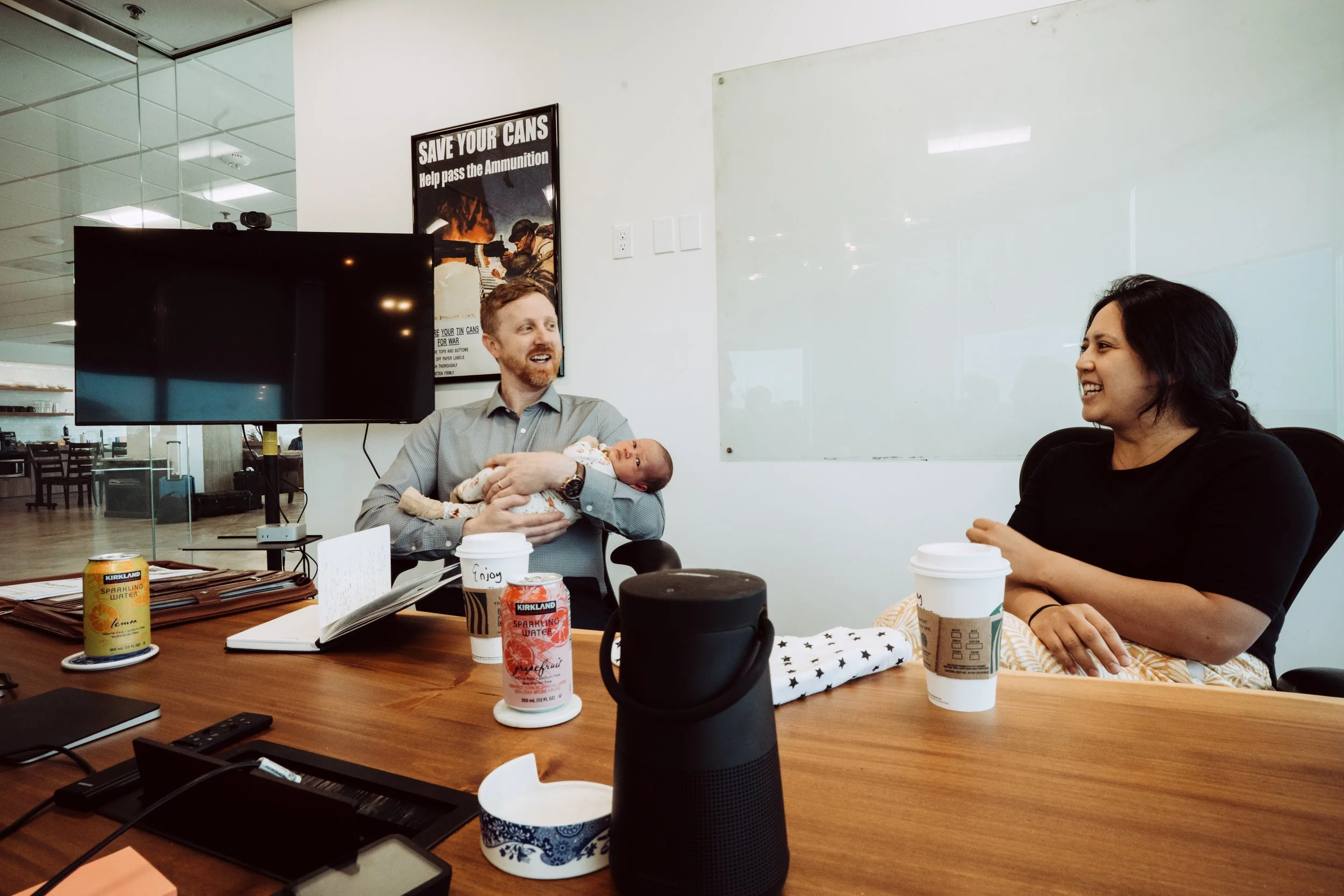
We gathered the data and presented our review at an in-person strategy sprint, which involved Ashley and Ryan hauling their newborn up to our conference room. Turns were taken bouncing the baby while also bouncing around the three “bodies.” Two positioning opportunities emerged:
The word "decide" originates from the Latin word dēcīdere, meaning "to cut off."
Branding is about stripping a brand down to a single-minded message that’s yours and yours alone. The key element is being single-minded. Coke sells joy. Disney sells magic. Apple sells creativity. Nike sells victory.
The two directions that emerged for Pearl were revelation and purity.
Pearl Option 1: Fertility, the way it was meant to be
One opportunity we saw was a brand affiliation play. We could tie the brand to the rising alternative medicine world. It’s no secret that the MAHA mom, who uses beef tallow, drinks out of mason jars, and shops at Whole Foods has driven an entirely new industry of values-driven health providers. Naturopaths, chiropractors, massage therapists, and birth centers, all with the same idea of reclaiming healthcare the way it was supposed to be: human, root-cause oriented.
Pearl already had credibility in this world. They get referrals from it. They show up at its events. They could’ve gone full “wellness brand” and cleaned up.
But this path, while viable, would have been the obvious move, and that’s rarely the right one.
Pearl Option 2: Discover your design
This direction surfaced through our research into the psychological profile of the woman struggling with fertility. Fertility is an area of tremendous personal shame for women, both due to regrets. For instance, we saw statements like “I wish I hadn’t been on the pill so long,” or “I wish we’d started trying sooner,” in forums discussing the topic.
As we listened to women share about infertility, we saw that fertility is not just a matter of physical health, but a matter of one’s core identity as a woman. This leads to a psychological hesitancy to take action.
Most brands incorrectly assume that what a woman wants in this stage is the typical medical brand. Sterile, authoritative, non-personal. Stock photography of pregnant women and medical devices abounds.


Pearl’s brand manifesto:
Once upon a time, a woman’s body was revered. It was seen as something sacred, a design so intricate, intentional, and astonishing. That reverence has been lost. And now, something is wrong with the way we treat women’s fertility.
Today, cycles are called disorders, and solutions come in syringes. If invasive treatment doesn’t force pregnancy, fertility is outsourced to labs. You’re rushed through appointments and procedures without receiving anything but more uncertainty and a bill.
Something in you resists. You know deep down this isn’t how it’s supposed to be. At Pearl, we know that too. What if healing doesn’t come from controlling your body, but from listening to it?
We are the clinic for every woman who’s ever whispered, “There has to be another way.” We know your body shouldn't be hacked, it should be heard. We believe that great fertility care is a practice of listening, discovering, and true understanding.
That’s why we don’t just treat symptoms or apply blanket solutions. Instead, we seek root causes.
Pearl will guide you with a custom plan throughout this journey. We heal infertility through timeless techniques, precision surgery, and advanced intervention care. We are medical professionals, but we offer more than mere tests and bills.
We keep ethics at the forefront, rooted in understanding your body’s design- it’s something to wonder at, a rhythm to follow, and a wellspring of incredible creative power. Pearl works with nature, with God’s design, not against it.
This is not just about getting pregnant. It’s about coming to know the power that lies quietly inside you, like a priceless pearl: your fertility.
Pearl Health. Discover Your Design.
Of course, a woman struggling with infertility wants to know that her provider is reputable and trustworthy, but one thing we saw in our research was that one of the primary complaints that women have with their fertility provider is one of the consistent complaints people have with the current healthcare system, but even more relevant here due to its personal nature:
“They didn’t give me any answers.”
The sterile, impersonal approach that healthcare brands often employ is out of place and opaque. Being the brand that stands for answers in this environment would be a serious advantage.
Pearl was uniquely positioned to fill this gap. As rigorous scientists and avid technologists who are always on the cutting edge of NaPro tech and a focus on discovering root causes instead of band-aid solutions, this could be a strong position.
Our Decision
Again, there is a sense in which Pearl will always be dedicated to doing healthcare how it was meant to be done. However, Pearl’s greatest advantage is their ability to offer both answers and cutting-edge technological solutions to healing root causes.
So we decided to position Pearl around the second direction, “Revelation.”

The Brand
Now that we understood the single-minded message, we knew what the aesthetic language needed to say.
Revelation. It would need to hint at the unfolding of a mystery, but not in a new-agey, esoteric way. It needed to feel natural, scientific, and systematic. We would explore lunar cycles, cellular structure, pearl textures, and even cervical mucus for inspiration.
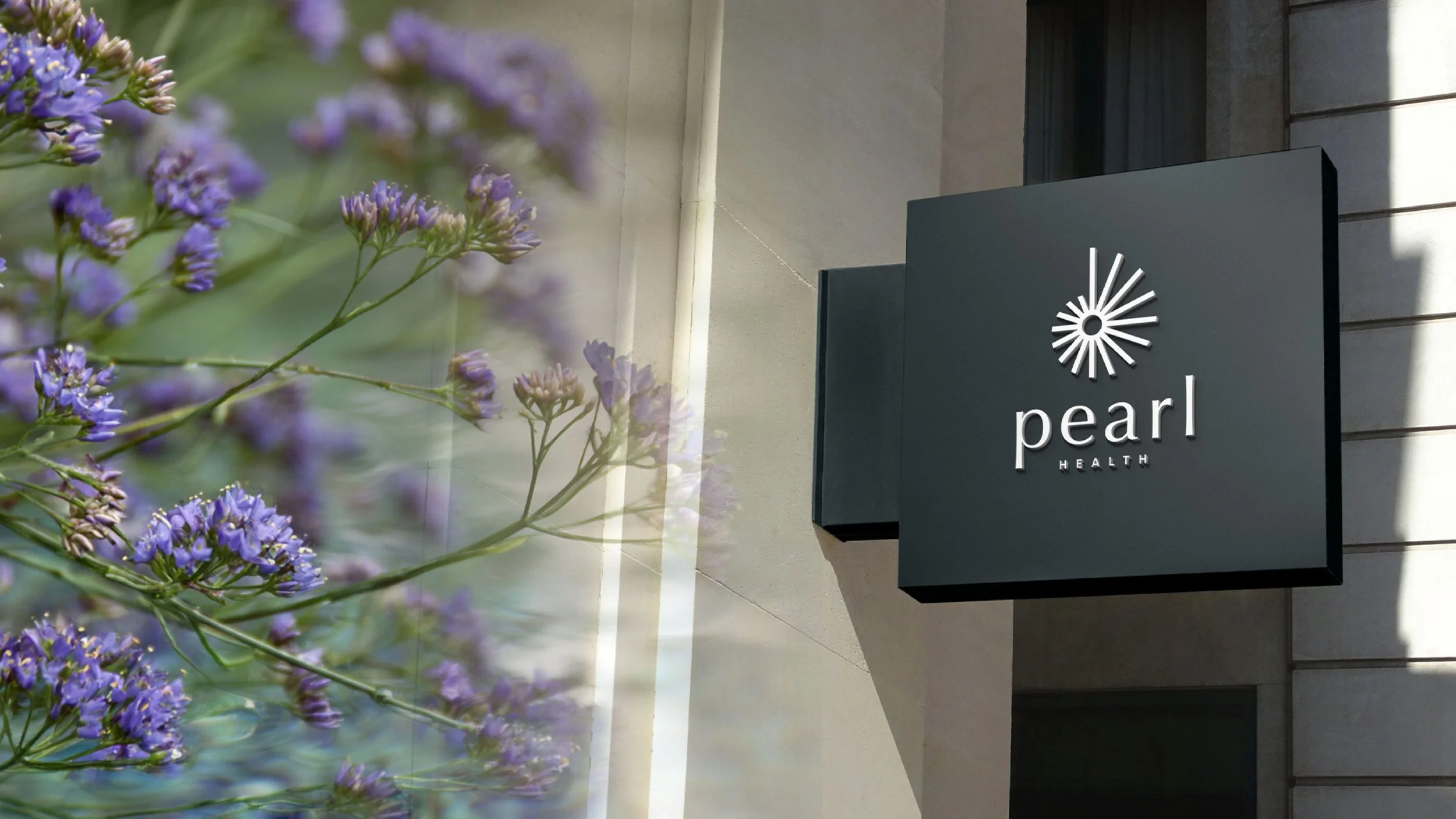
The Logo
The logo draws its form from one of the most remarkable elements of pattern recurrence and ratios in nature: the conch shell. It features a staircase that descends into the center, resembling a pearl. It also hints at a star or the beams of the laser they use for surgery. It’s premium, systematic, technological, and revelatory. It bears no resemblance to anything in its category.

Fonts
We took inspiration from feminine healthcare brands like Aesop. These women, by definition, are millennials and Gen Z, after all, and they have a much higher aesthetic preference than Gen X and Baby Boomers, who are the primary target of most medical brands. These fonts convey a sense of elegance, intelligence, and refinement.


Colors
We initially explored blues and greens, as these were the original colors of the brand, but it wasn’t feeling right. We began experimenting with purple, and the brand started to take off.
This proved magically synchronous. Ashley Womak joined us at our next meeting in a park surrounded by purple-flowered Vitex trees in bloom, which are native to the DFW metroplex and are known for their properties that increase fertility. We then realized that this color has a rich history of association with fertility.
Nectar Guides: Purple stripes in flowers that direct pollinators to reproductive parts
Traditional Medicine: Purple herbs are used to restore hormonal balance
Mythology: Fertility goddesses like Iris and Dionysus are often depicted in purple
The rest of the palette was drawn from mother of pearl and soft green hues found in nature, grounding the brand and balancing purple, which could easily overwhelm the brand.

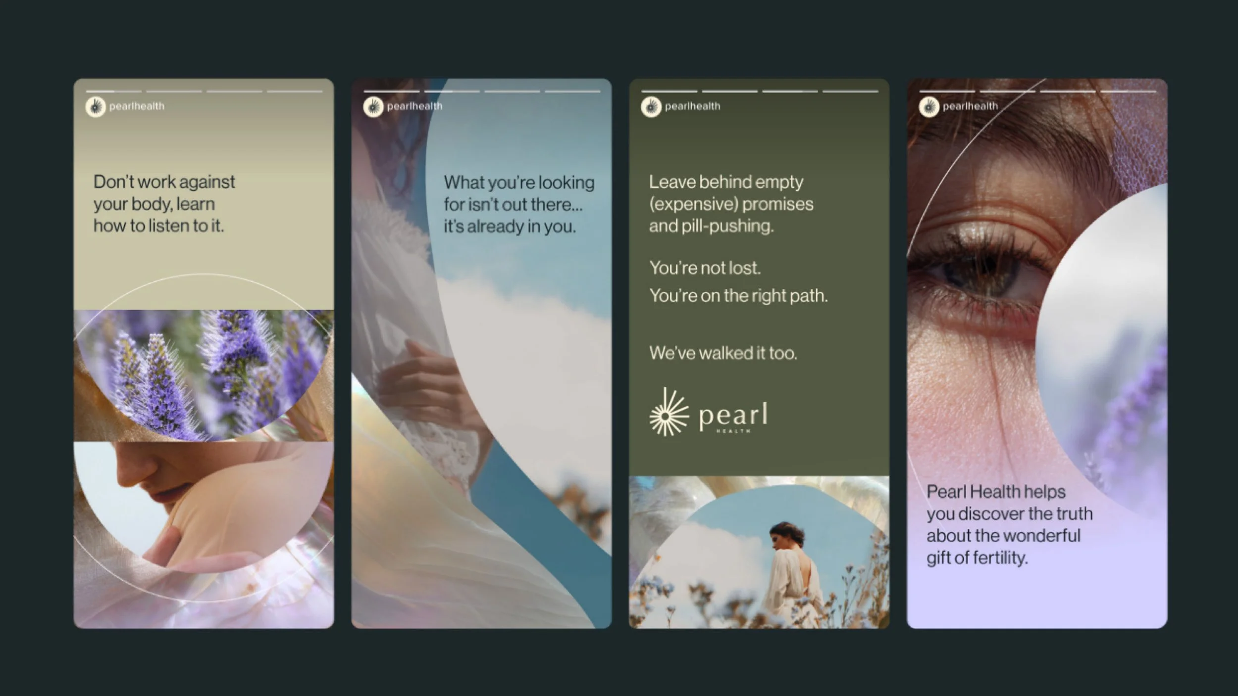
Photography
Most brands in the field do the obvious: show pregnant women or women with babies. But this runs directly counter to the insight about the identity and shame dynamic at play. These images are not aspirational for a woman struggling with fertility. A woman instinctively feels “less than” when she sees another woman who has “had her miracle.” Therefore, the brand would not feature pregnant women, happy families, or newborns. Instead, all photography would hint at an unveiled mystery. All photos would show partial women, never in a portrait, facing the camera straight on. The feminine charm of woman is her mystery, and this would be incorporated into every photography use case.


Layering
The use of flowing layers was conceived to give designers greater flexibility and to allow individual photos to always have a sense of mystery, even if the photo selected isn’t the perfect “coquettish” fit we’re looking for. Brands must be executable, and this element allows a designer to make even imperfect images work.

Results
Although most of the companies we work with instantly feel the benefits of greater clarity, it takes time to roll out the brands and to see the impact in the data.
Pearl is currently in the process of applying their brand to their website, building, and marketing materials, so all results are purely anecdotal at this point. We will update this case study in 2026, once the brand is fully implemented and the impact has had sufficient time for measurement.
Until then, here is what the client had to say: