Scanning the Horizon
Peregrine Group Website Redesign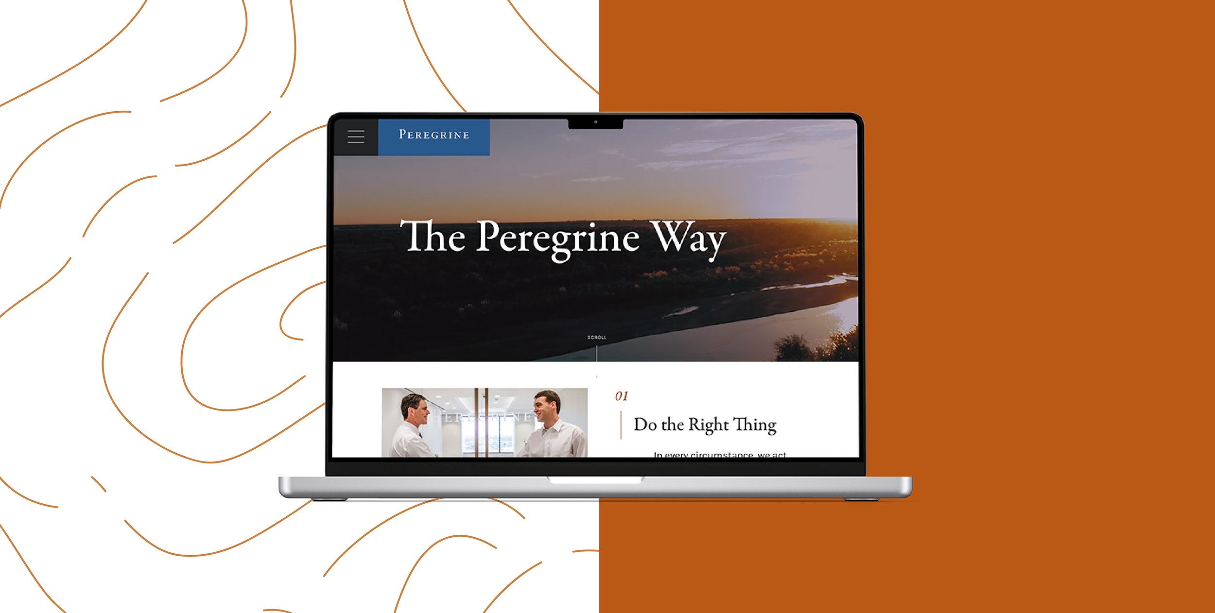
In such a large and established industry, the Peregrine Group — a small, family-owned petroleum and investing company — is truly unique. Even more unique is the respect they’ve garnered among peers while retaining a meaningful culture throughout their time in business. All of this positioned Peregrine to enter a new stage of growth.
However, Peregrine knew their online presence needed to catch up to their prospects for the future. Peregrine wanted to attract excellent new employees by leading with their strong values and familial work environment. They wanted current and potential partners to see their professionalism, trust their expertise, and understand the culture that made Peregrine unique. Ultimately, their growth potential relied on a powerful online presence to set them apart.
A Partnership is Born
We were honored that Michael and the Peregrine staff approached us to make this new website a reality. The group holds their core principles, which they call “The Peregrine Way,” in high regard, and they felt that our Sherwood company values were so aligned with theirs that we would be the best fit for the project. We were thrilled to partner with a team that had already uncovered what they stand for— and was truly living its beliefs. We immediately got to work.
Subverting the Status Quo
Designing an effective web identity for the Peregrine Group involved a few major decisions.
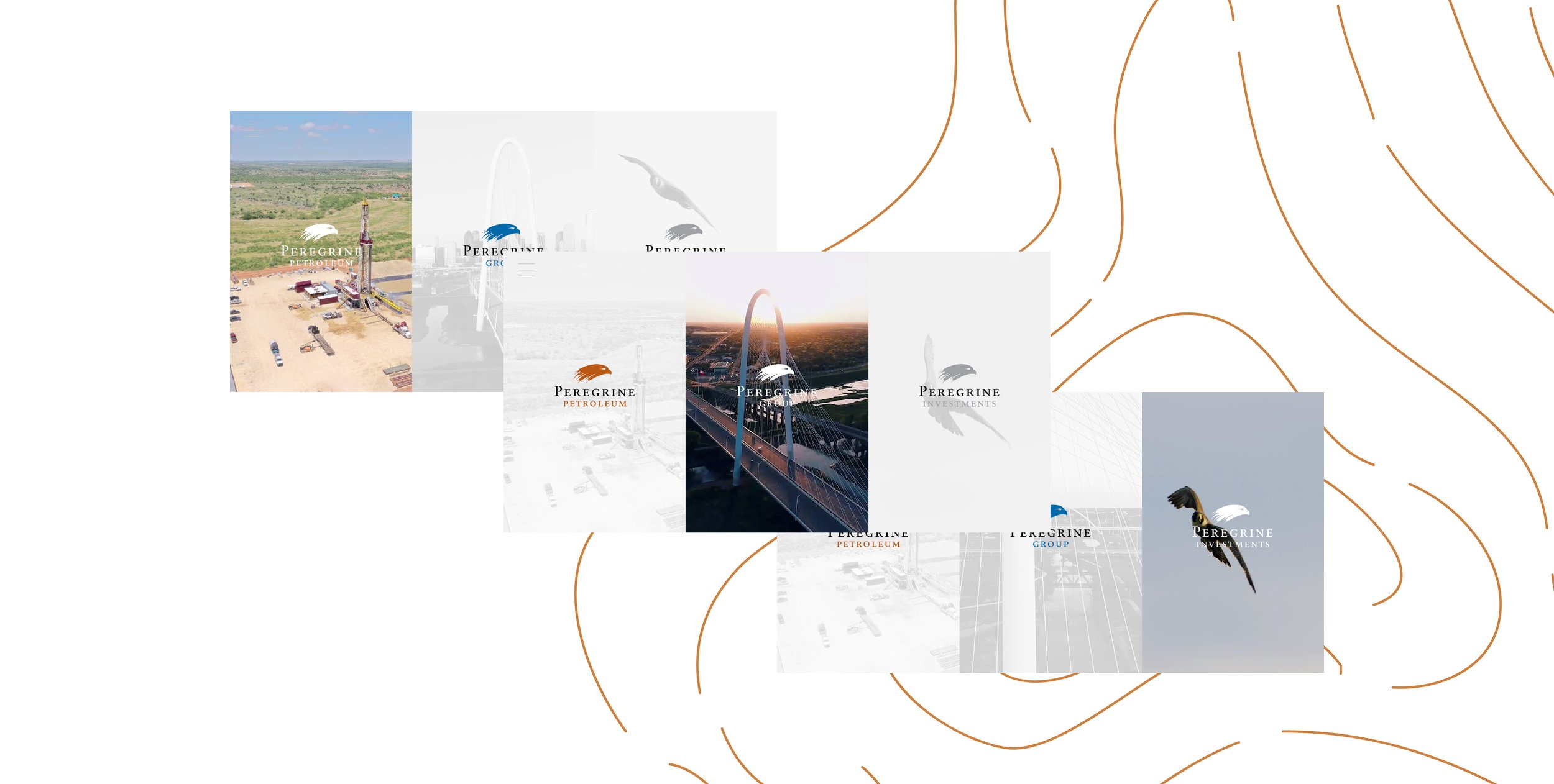
First, the organization actually has three branches: Peregrine Group, Investments, and Petroleum. These branches needed to be represented in an independent yet seamless way.
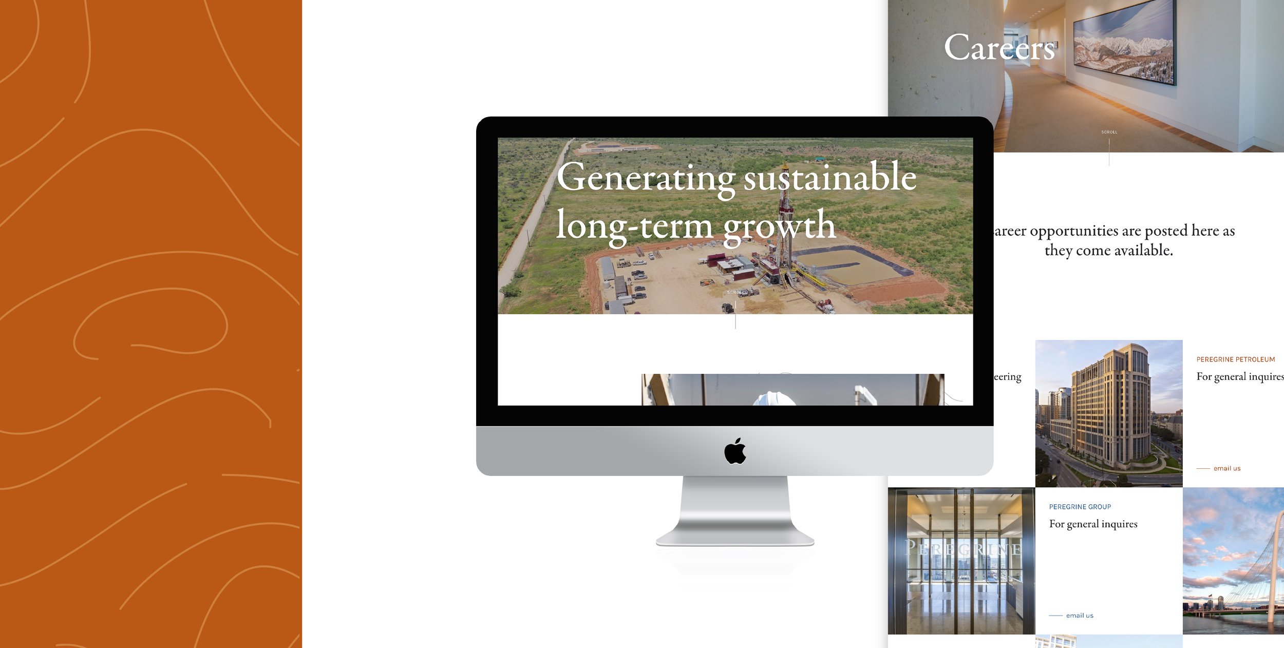
Peregrine also prioritized potential employees, especially their impression of Peregrine and their ability to access career information. They knew that their current website, though professional, didn’t reflect their familial work environment; they needed more than pictures of empty boardrooms to attract the most excellent new talent. The new website would need to immediately impress potential hires while clearly directing them to career information.
It wasn’t just young career-seekers accessing the site; Peregrine draws a whole range of ages within their multiple branches, which meant their online presence needed to work across all devices and be accessible for users of every proficiency level. They had to check multiple boxes to fulfill industry standards, including an easy to access avenue for press releases, but that didn’t mean that they needed to maintain the industry’s status quo. After all, their “Learn and Improve” value held them accountable to improving the industry standard, not copying it.
The War Room
With all of these challenges in mind, we visited Peregrine’s impressive top floor Dallas office for the first time and were amazed with one room in particular: a back boardroom that’s more akin to a war room in a general’s field house. Topographical maps cover the walls, surrounding a large table where executives and partners strategize for growth. The maps delineated all the areas Peregrine operates with small, detailed lines wrapping and swirling across the pages. Our creative sensibilities were immediately inspired the second we walked in.
During our initial investigation, Michael, the CEO shared with us that the name for the group came from the Peregrine Falcon-not the biggest hunter in the bird kingdom, but the most agile predator of the skies. A former Air Force pilot, Michael knew the combination of experience and adaptability that creates success; he explained that a bird’s-eye view was the best way to see, and that Peregrine’s greatest strength was its ability to perceive opportunity and instantly position itself to take advantage of it.
Soaring above ground, scanning the terrain, seeing everything from the top . . . the metaphor nearly creates itself. The website doesn’t. That’s where we came in. In partnership with their expert marketing team, we struck out to design a world class website together.
Enjoying the Journey
When you land on Peregrine Group’s website, topographic lines unfold and trace across the screen, a subtle backdrop throughout their online presence.
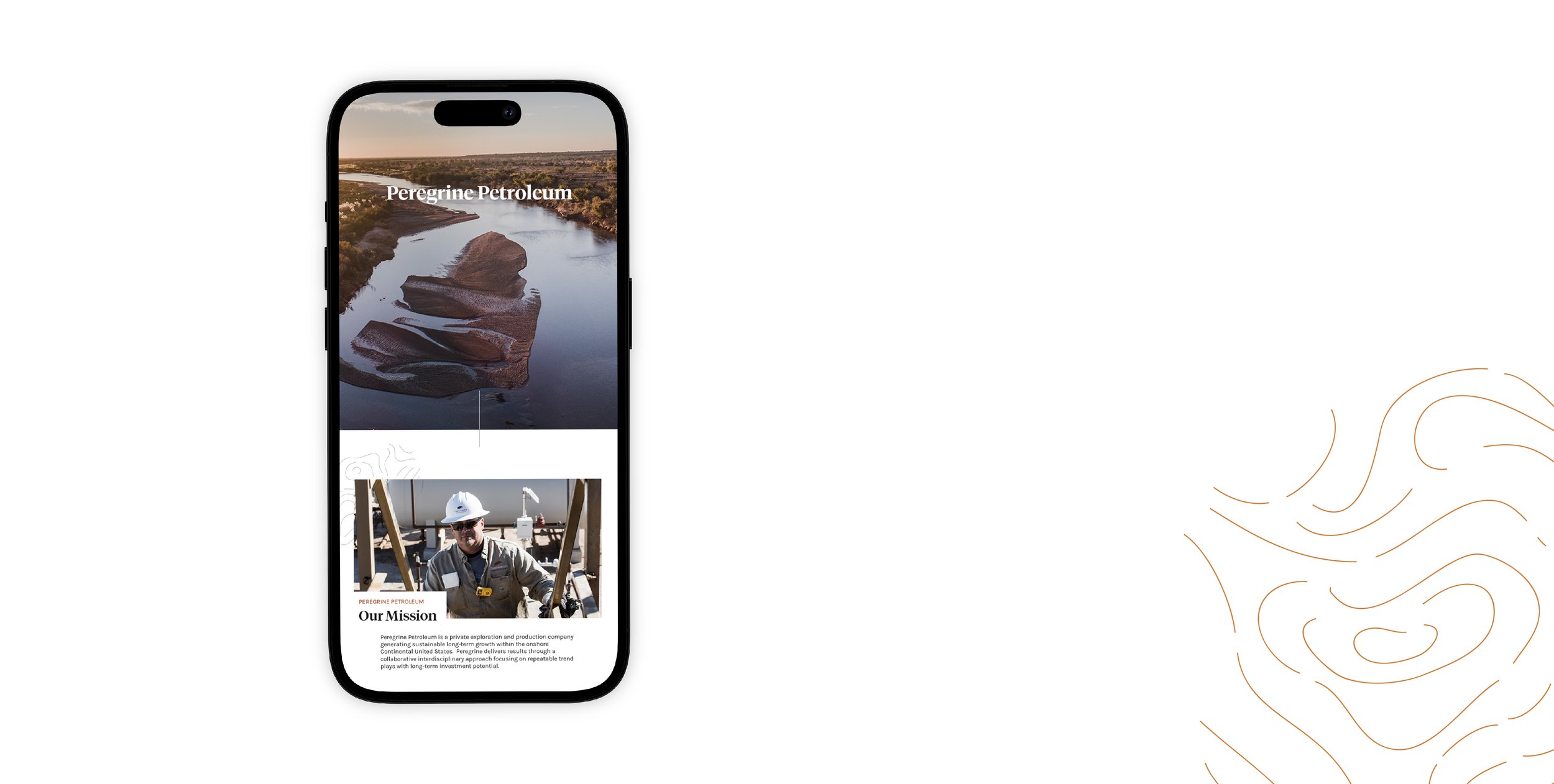
Their homepage invites users to enter one of the three branches, distinguished by different colors and underscored with bird’s-eye view video: a soaring peregrine, Texas’ landscape, and the Dallas skyline. The first moments of Peregrine’s website experience speak to their value, “Enjoy the Journey.” We wanted to ensure every step of journey through this website was simple and stunning.
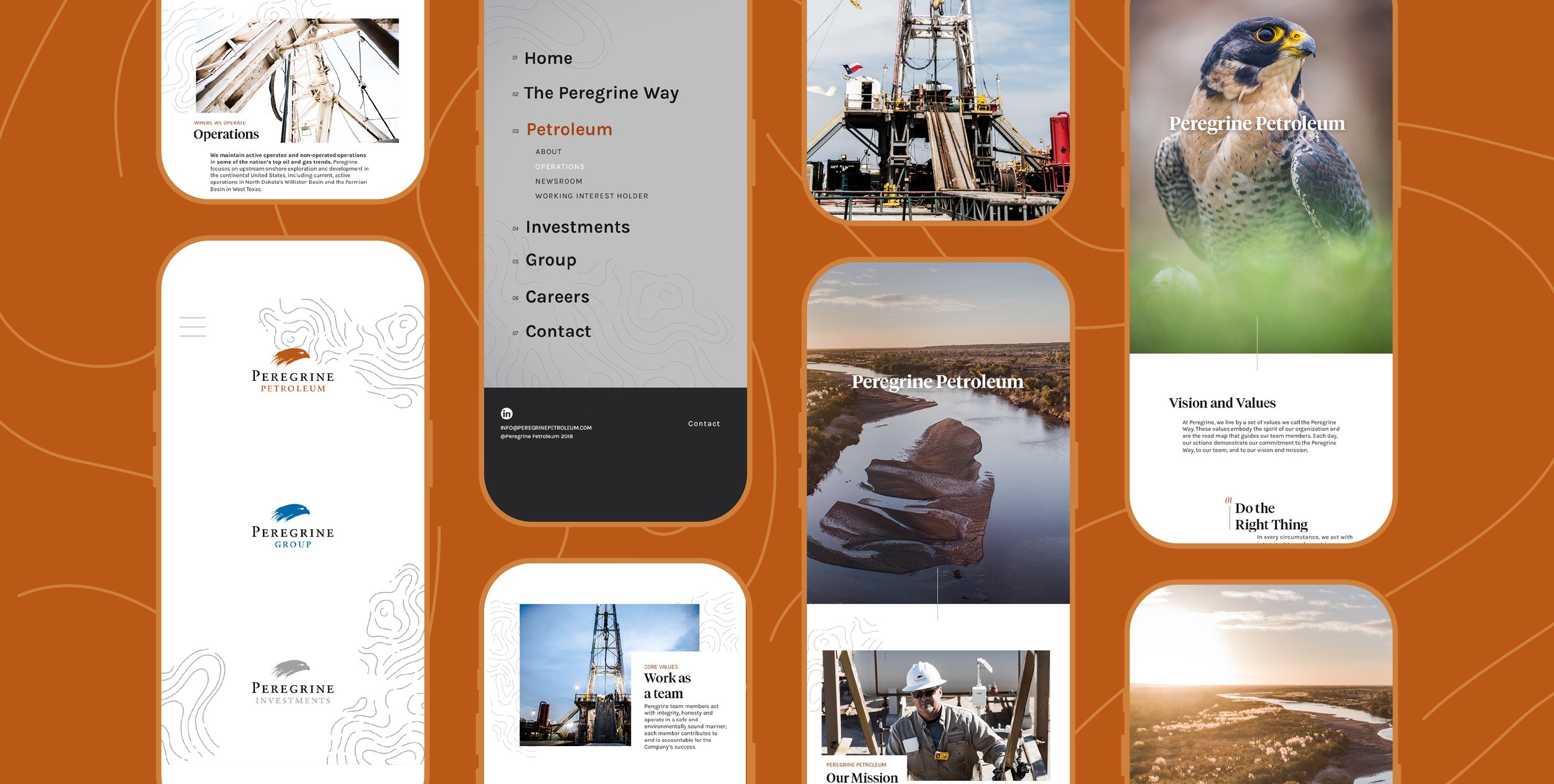
On each page, we included a scroll bar that discreetly directs users to continue down the page to find the information they’re looking for — but they’ll never have to search very far. All of the information was streamlined so that users can access exactly what they need. A clear menu also helps website visitors toggle between the Group, Investment, and Petroleum pages as needed, as well as access career and contact information.
No information goes without a subtle yet meaningful call to action; simple links to career and partnership opportunities help redirect anonymous prospects towards personal interaction and, if it makes sense, an eventual relationship with Peregrine. We developed an easy-to-use back end so contact and employment information is a breeze to update.
We also helped them stand out among their peers with their “Newsroom” page. In the oil industry, press releases are the standard means of mass communication. Their newsroom puts a spin on an ordinary press release, making it an engaging experience with images and video content that automatically gets pulled into each page.
Most importantly, Peregrine’s website began to truly reflect who they were. High quality drone footage showcased the excellence of their operation. Lively human photography spoke to their collaborative and engaging environment. The clean design reflected their respected place in the industry.
Opportunities on the Horizon
Our favorite part is that The Peregrine Way plays a central role in the website. Their values scroll across the bottom of each page, reminding every user of Peregrine’s foundation: integrity, excellence, humility. We believe that a group’s values are the cornerstones of their identity, and in a very real way, Peregrine’s values appear plainly in every corner of their online identity — not just in the scrolling beliefs, but in each color choice, each classic font, each impressive photo.
Their employees and stakeholders felt the same way. After the marketing team unveiled the new site, Michael and his staff knew that their opportunities to effectively engage partners online had multiplied. Their ability to recruit new employees had grown. Their web presence became an image of what Peregrine truly is: a team of people with character, founded on tradition and constantly innovating, scanning the horizon with a bird’s-eye view for new chances to grow.
One of Peregrine’s values is “Work as a Team,” and they truly invited us into the Peregrine team for the duration of the project. We truly “Enjoyed the Journey” with Peregrine and hope to work with them on more projects in the future.
Brand Guidelines


