Renewing Love in Marriage
EverMore In Love Brand Identity, Name, and Website
A solid foundation to create from.
After a deeply moving Sprint with another creative agency, the Pastoral and Matrimonial Renewal Center had reconnected with their vision and built a strong understanding of their goals. But the tangible expression of that mission — their design, website, and especially their organization’s name — needed some major updates to reflect their unique approach to marriage ministry. They also wanted to build a brand identity that would offer a smooth transition between the founders and new leadership. We loved taking PMRC through our Blitz process; we connected so deeply with their belief in lifelong love, and we were excited to work on a brand strategy worthy of their ideals.

Unblocking creativity.
The leadership team had experienced deep disagreements during the renaming process, and frankly, they were stuck. We facilitated a discovery process that brought forth new ideas, encouraged better conversations, and ultimately helped PMRC find a name that reflected their belief that being “in love” shouldn’t be a season for married couples, but a lifelong experience. PMRC’s marriage ministry, Living in Love, became EverMore in Love.

A brand built for life.
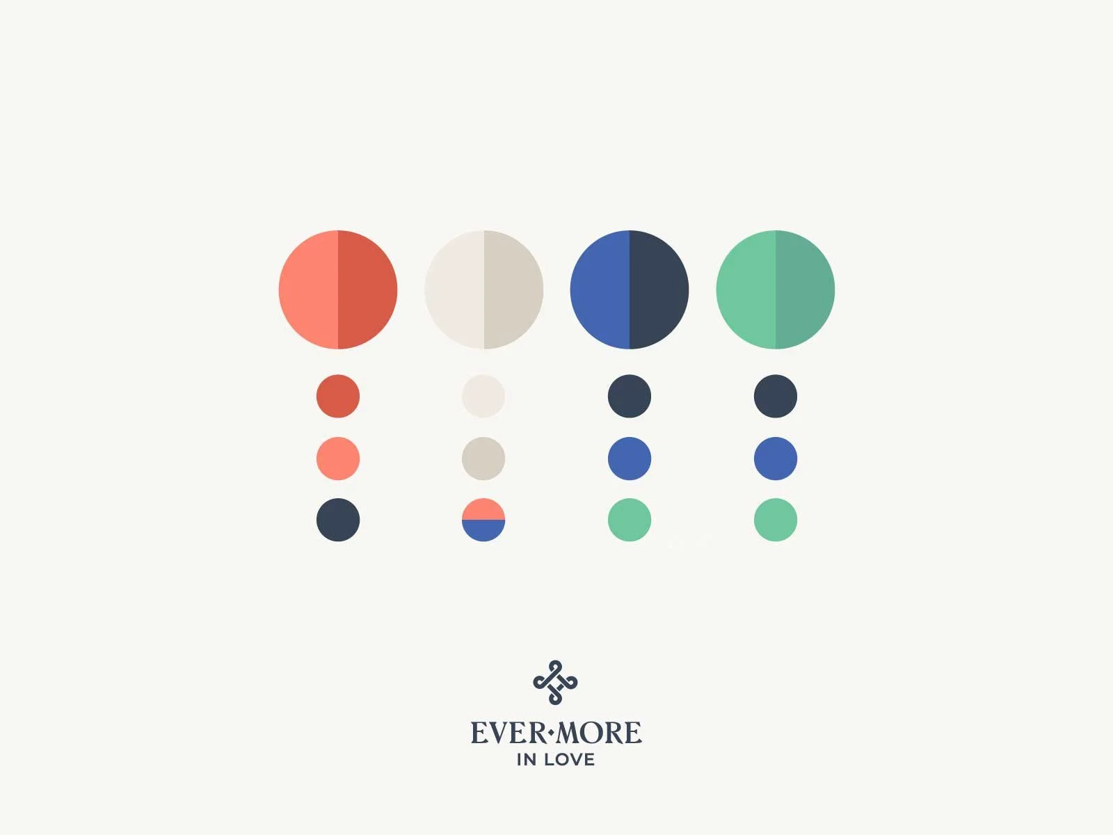
EverMore in Love’s visual language incorporated nostalgic colors and typography with a modern twist: a nod to the early innocence of love that they encourage couples to believe they can recover and build on. With organic shapes alluding to the curves of the human body and a light speckled pattern, their brand stands out in the Catholic marriage ministry space. Their central logo is the Celtic cross, a sign of eternal love in an unending knot. Our website build helped EverMore go one level deeper, giving them a better understanding of their services and the way they organize their content. We created a web strategy that streamlined their central offerings for easier access.
When the EverMore in Love leaders shared these updates with their board and volunteers (which is always a tricky thing to navigate), they got rave reviews: a sign that, together, we’d created a brand identity which reflected their deepest ideals.