

Swiftly Deliver Answers to life’s biggest questions
Our job was simple: Make answers to life’s biggest questions accessible, engaging, and motivating. We were tasked with redesigning Catholic Answers website to engage new users, retain their regular audience, and convert them to shoppers or supporters.
The Team1x Creative Director
1x Project Manager
1x Copywriter
1x UX Designer
TimelineTotal: 14 Weeks
Research: 4 weeks
Branding: 2 weeks
Wireframing: 4 weeks
Design: 4 weeks
Rationale
As all content creators know, simply putting a bank of resources online doesn’t mean people will find them. If people do find them, they might not stay for very long or come back for more. And if they do stay, return, or even bring new viewers, content creators then face the question — how does each view impact our bottom line?
Catholic Answers had been creating content for decades and had built up a sizable audience by 2018, but their users weren’t finding the content they wanted or converting to revenue.
Catholic Answers asked us to audit their site and look for opportunities to
Engage users by delivering answers more effectively
Retain new users and lower bounce rates
Convert users from content consumers to donors or shoppers

Step 1: Research
Through a process of interviews with staff, user focus groups, and traffic analysis we discovered Catholic.com had 6 core redesign opportunities that we believed if capitalized on, could dramatically increase engagement, retention, and conversion.
NavigationHierarchyTrustContent deliveryDataFormat
Navigation
Users were arriving at Catholic.com with faith topics they wanted to explore. Catholic Answers' goal was to deliver content clearly, while also building a relationship with their audience. These two goals were competing with each other in the original design. Without a clear navigational menu that prioritized searching, users weren’t able to navigate to their preferred content quickly, which was lowering click-through rates.
Hierarchy
The lack of a clear navigational structure meant that the audience often didn’t know where they were on the site on any given page. Additionally, ads, promotional content, and actual media content were all competing for audience attention above the fold. This led to a high bounce rate especially with users that weren’t already familiar with the Catholic Answers brand and arrived through traditional search engines like google.
Trust
We found that the site was particularly struggling with engaging new audiences from traditional search engines, even though that accounted for a large portion of Catholic Answers traffic.
We discovered:
67% of first-time users arrived from traditional search engines
81% had a stressful instigating life event that lead to the search
14% read more than 3 articles their first time on the site
59% were using mobile devices
Building trust with new users would be key for growing engagement with content as well as converting to their two revenue streams, product purchases and donations. In its original design, the site was cluttered with ads that clashed with Catholic Answers content and gave the user an impression, not unlike an overzealous door-to-door salesman. The site’s priority would need to be getting their audience answers to their questions quickly and delivering ads more subtly.

Related Content
The site didn’t encourage engagement by promoting related content. Any single media piece was fairly easy for the audience to access, but discovering more items required them to search for that topic again in the search engine. This was an unnecessary step. Related materials and ads could be promoted to increase content exposure, time on site, and visitor engagement.
List Building
The email newsletter’s CTA was not offering specific value. We saw an opportunity for building Catholic Answers email list by making newsletter subscriptions more clearly valuable and related to highly visited content.

Format
The “one-page” style of the website was causing several usability issues. We found several problems with searching and filtering on both mobile and desktop devices that were impacting engagement and bounce rates, as well as limiting SEO rankings. Rebuilding the site with a traditional content layout would vastly improve the user experience for mobile users.

Step 2: Brand Refresh
After our audit, the Catholic Answers team was ready to get started on the site, but we know that a compelling site is a product of a compelling brand, so we began by clarifying Catholic Answers' brand positioning and voice.
New Audience Profile
We started by creating a new user profile from our user research in order to understand the audience and their mindset when visiting Catholic Answers better and ensure that everyone working on the site from our designers and copywriters to their content production team would be working in sync.

We assembled Xavier's profile from actual stories we heard from CA staff and users. Xavier is a 35-year-old business analyst with a degree in Mathematics from the University of Arizona. He was raised Catholic but left the faith after taking a philosophy class in college. He is intellectually curious, listens to podcasts by Jordan Peterson and Sam Haris, and is in a tenuous and young relationship with a career-minded woman named Stephanie. After an argument breaks out between them about marriage, divorce, and children, Xavier realizes that his faith upbringing may have had more of an impact on his opinions than he previously thought. Later on, he searches several questions related to his argument with Stephanie and clicks on a Catholic Answers search result.
In order to win Xavier over, Catholic Answers would need to take into account his emotional state at the time of his search, his “no-nonsense, just the facts” approach, and the suspicion of Catholic organizations he carries with him into his search.
Brand Voice Guide
With Xavier’s profile in mind, we inventoried the language of the current site and gave them a new handbook for design and copywriting that would put their best foot forward and help ease the tension that the audience would feel on the website for the first time.

Step 3: Design
To build a navigation experience that the user would be familiar with and would be clear and organized we moved all internal links to a hamburger menu so that the search function could take precedence. Since one of our central goals was to promote conversion to shop and donate, as well as to build trust with our audience, we left About, Shop, and Donate on the main menu.
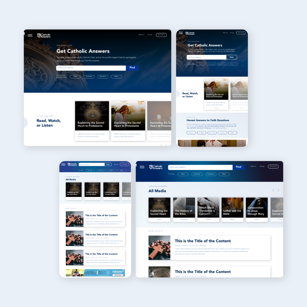
Content Hierarchy
We knew that delivering content to the user immediately without add and link clutter was vital to winning over both new and old visitors alike. We used a simple filtering process and clean masonry to promote engagement and to make it easier for users to filter the type of content they were looking for.

We simplified the process of navigating from content types to articles and from articles to related content. The users would know where they were at any given time on the site and subtly encouraged continued engagement by placing related and relevant content on every page.

We simplified the process of navigating from content types to articles and from articles to related content. The users would know where they were at any given time on the site and subtly encouraged continued engagement by placing related and relevant content on every page.

Adds were a necessary part of Catholic.com’s revenue, so we needed to build in ads, but without taking away from the content. Instead of placing ads in a permanent sidebar, we put them in the content itself. This would encourage click-through and make Catholic Answers ads more effective.
Results
We worked closely with the Catholic Answers team to ensure the designs were developed effectively, and then 6 short months after we’d done our initial audit, the site was launched. The feedback from users was instant. Catholic Answers polled their audience one month after the site launch and found that 90% of users had found what they were looking for. This was a full 33% improvement in accessibility. The Catholic Answers audience feedback was enormously positive, but as we all know, user feedback doesn’t always mean that there will be an impact on the bottom line. In this case, however, users opened up their wallets when Catholic Answers launched their next fundraising campaign.
By the end of the year, Catholic Answers had raised $100,000 more than they’d ever raised and the team attributes that in large part to a more enjoyable, experience online and to removing friction from the donation process.
“I HIGHLY recommend Sherwood Fellows, not just because they are good at design but because they are fantastic problem solvers. Hire them, you won’t be let down.”